Cloots
BRANDING
A branding and corporate identity guide for Cloots. This was an assignment for the course Graphic Design 4 of the AP University College (2019 - 2020).
About
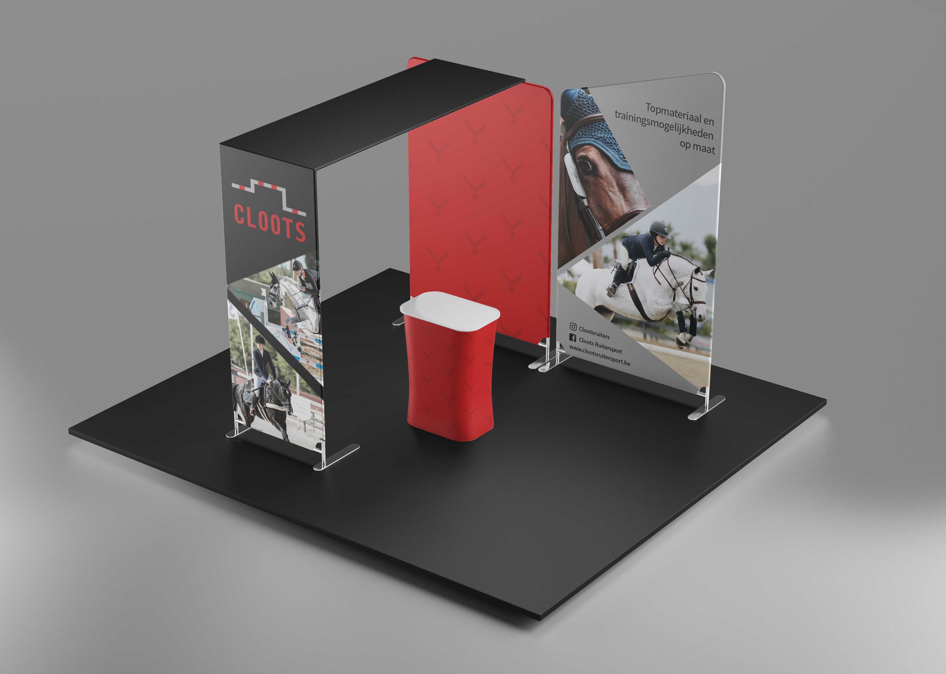
Cloots is an equestrian shop located in Willebroek. Quality materials and top training possibilities are the core of the business. Quality, professionalism and competitiveness are values that characterise Cloots.
The archetype that shares these values is the "Hero". This archetype is determined, achievement-oriented and purposeful. Cloots is committed to ensure that the hero can achieve all his goals in equestrian sport.
The visual identity created for Cloots is based on this archetype.
Process
Research < concept development < logo < corporate identity < brand guidelines < brand manual
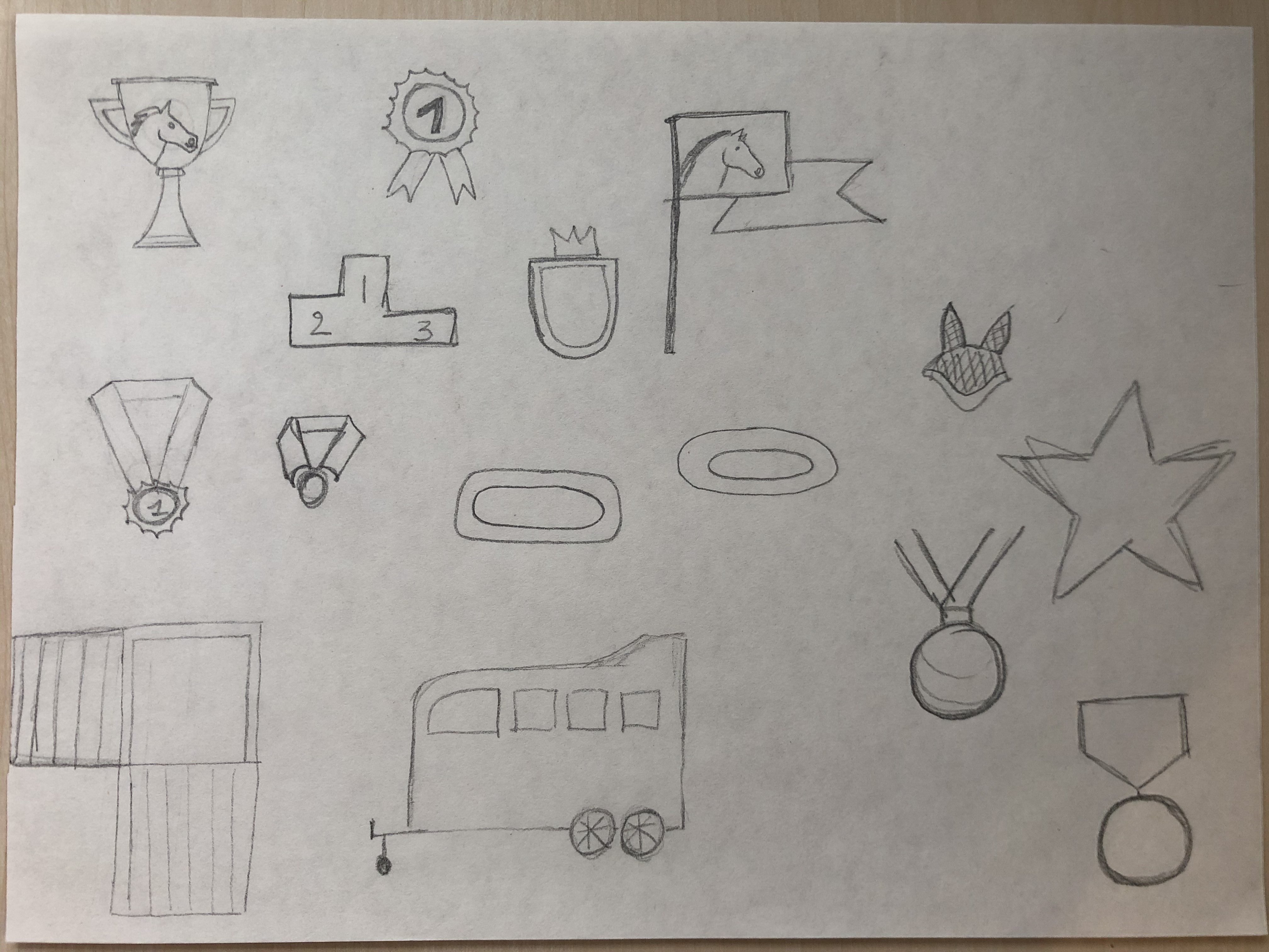
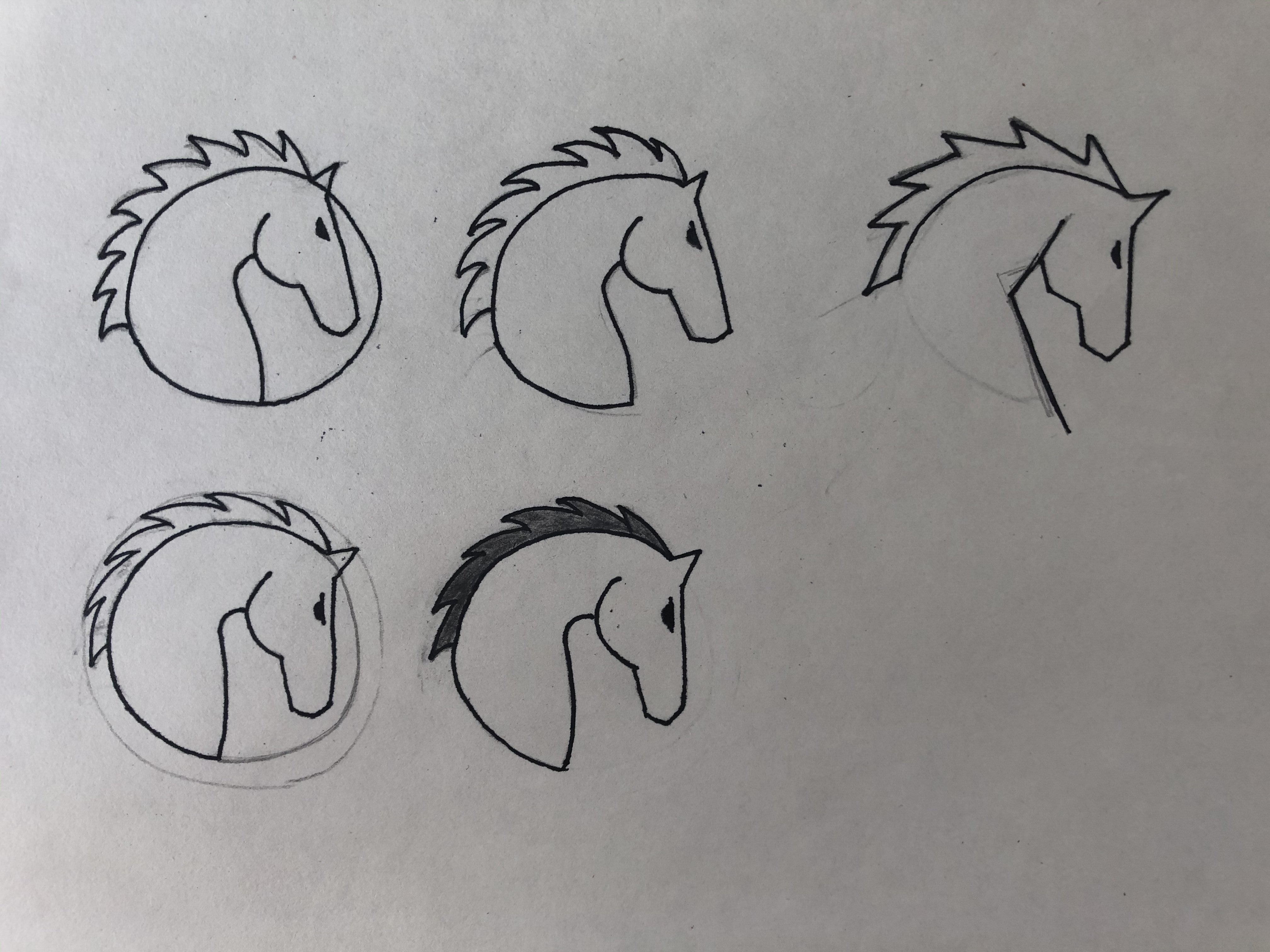
Sketches
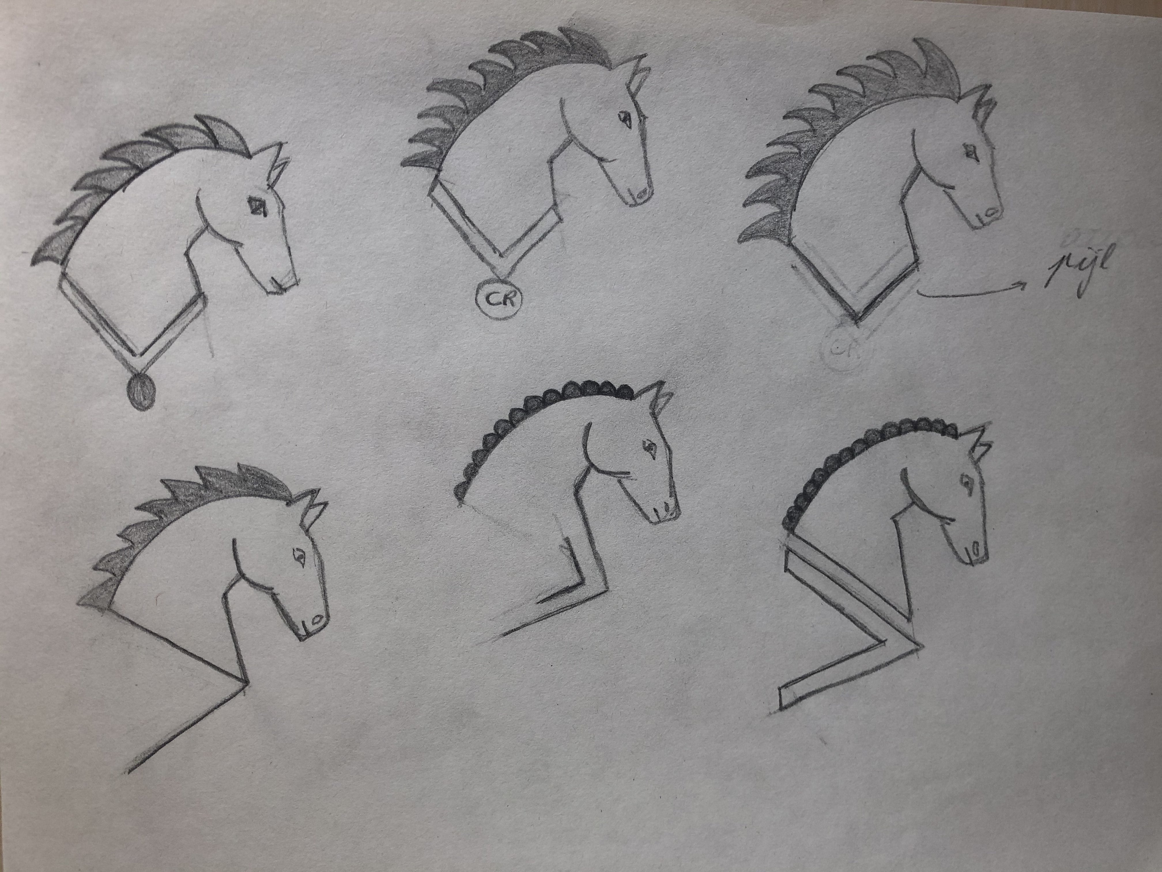
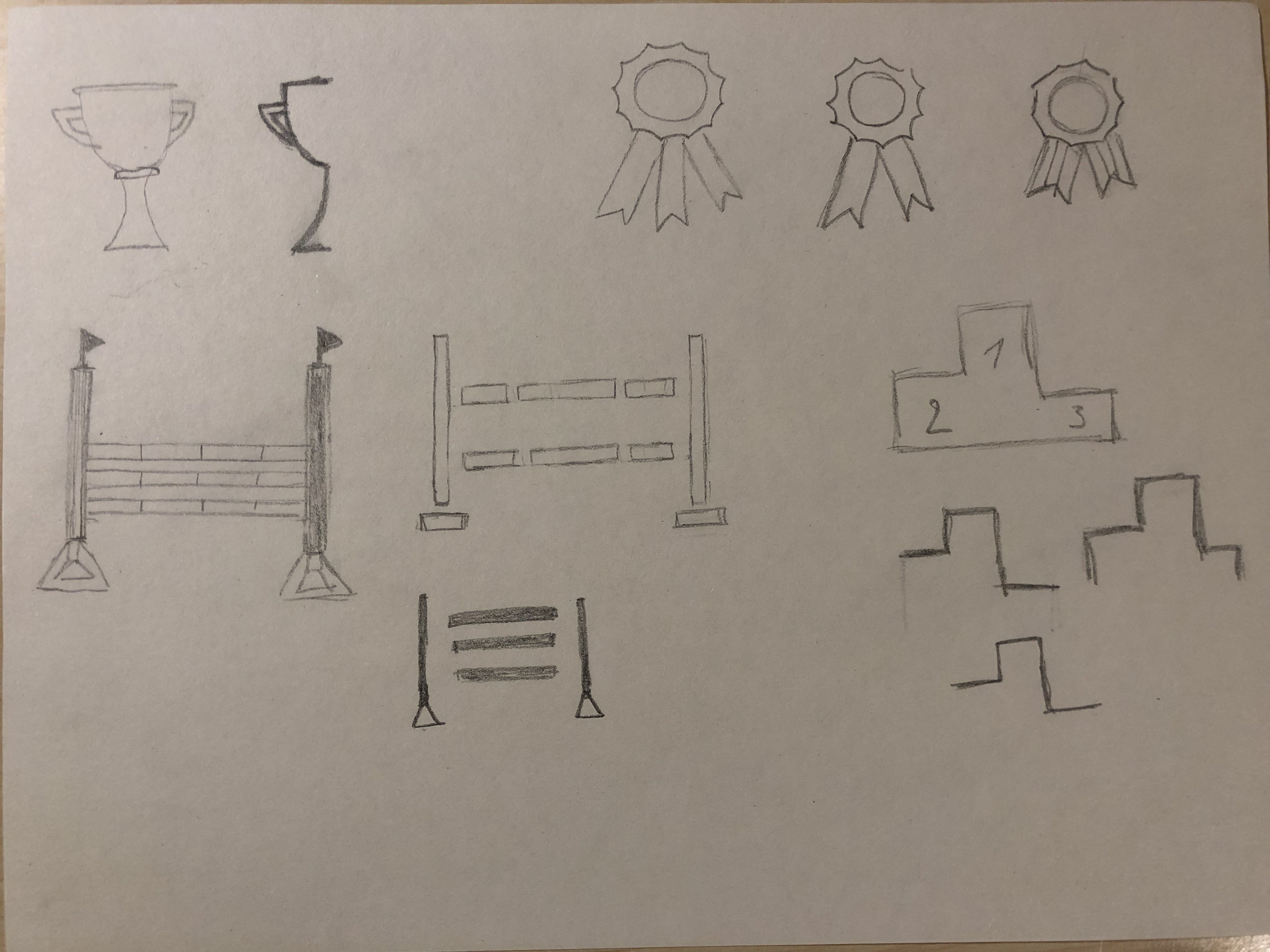
Concept & logo
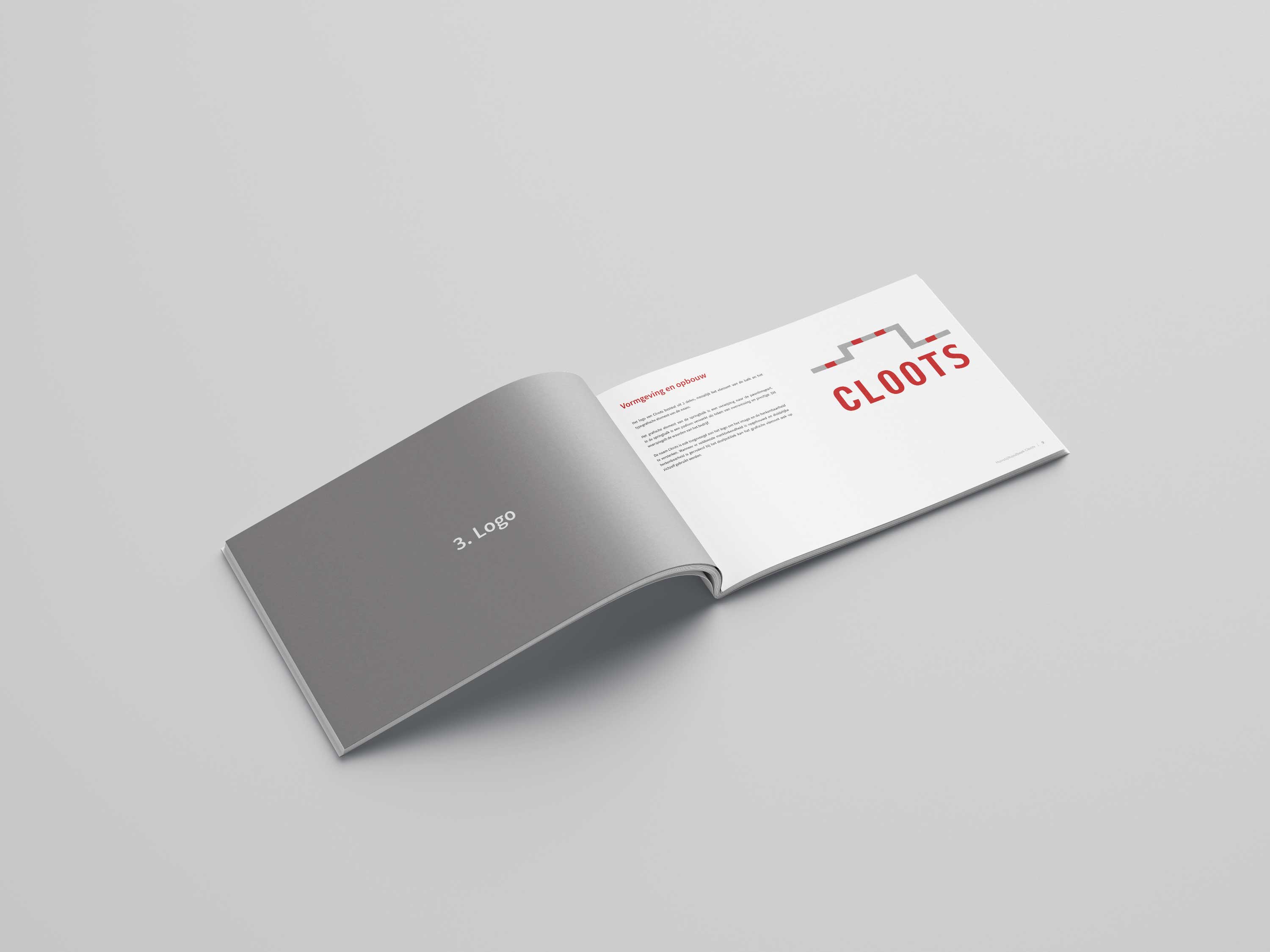
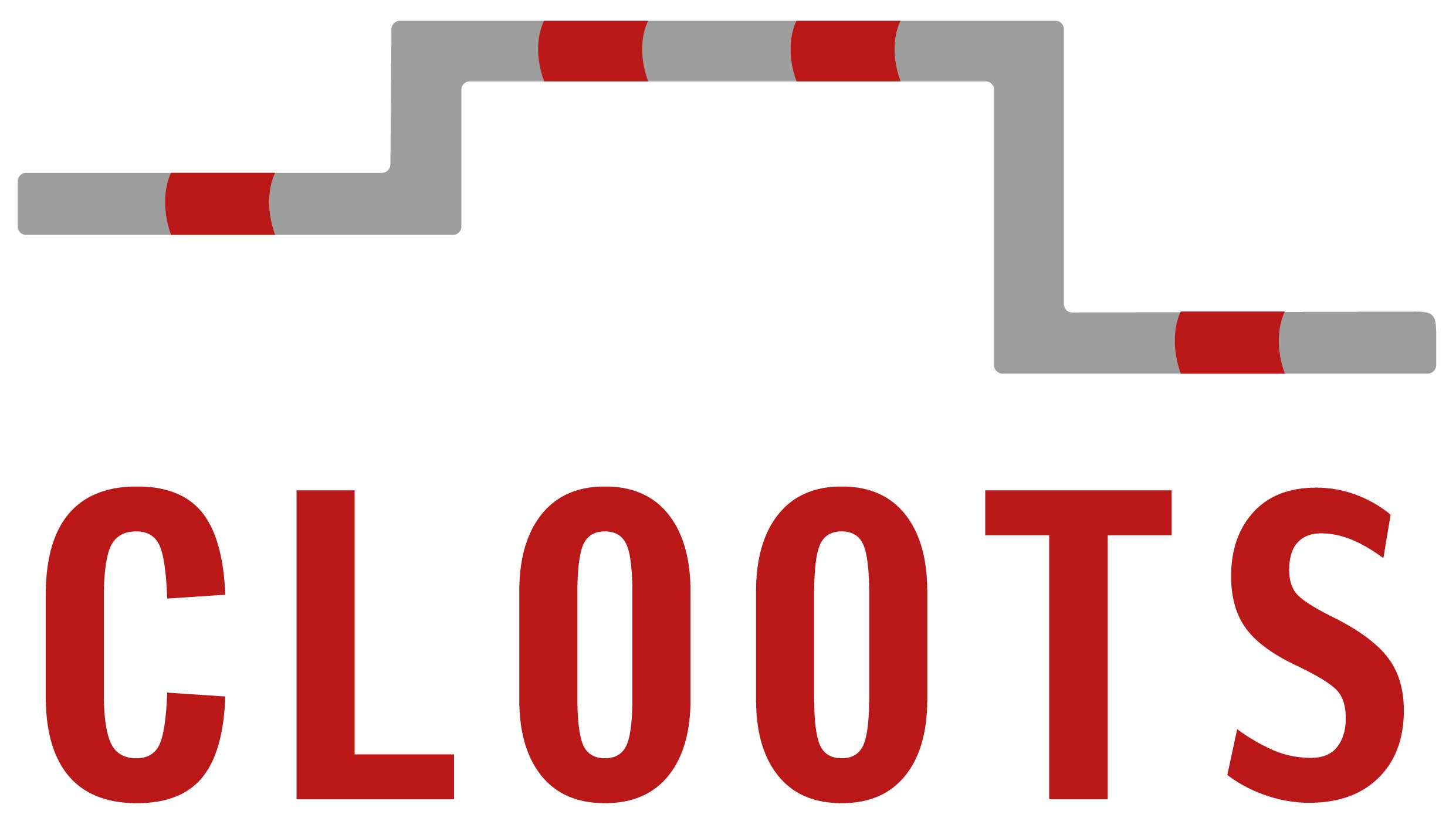
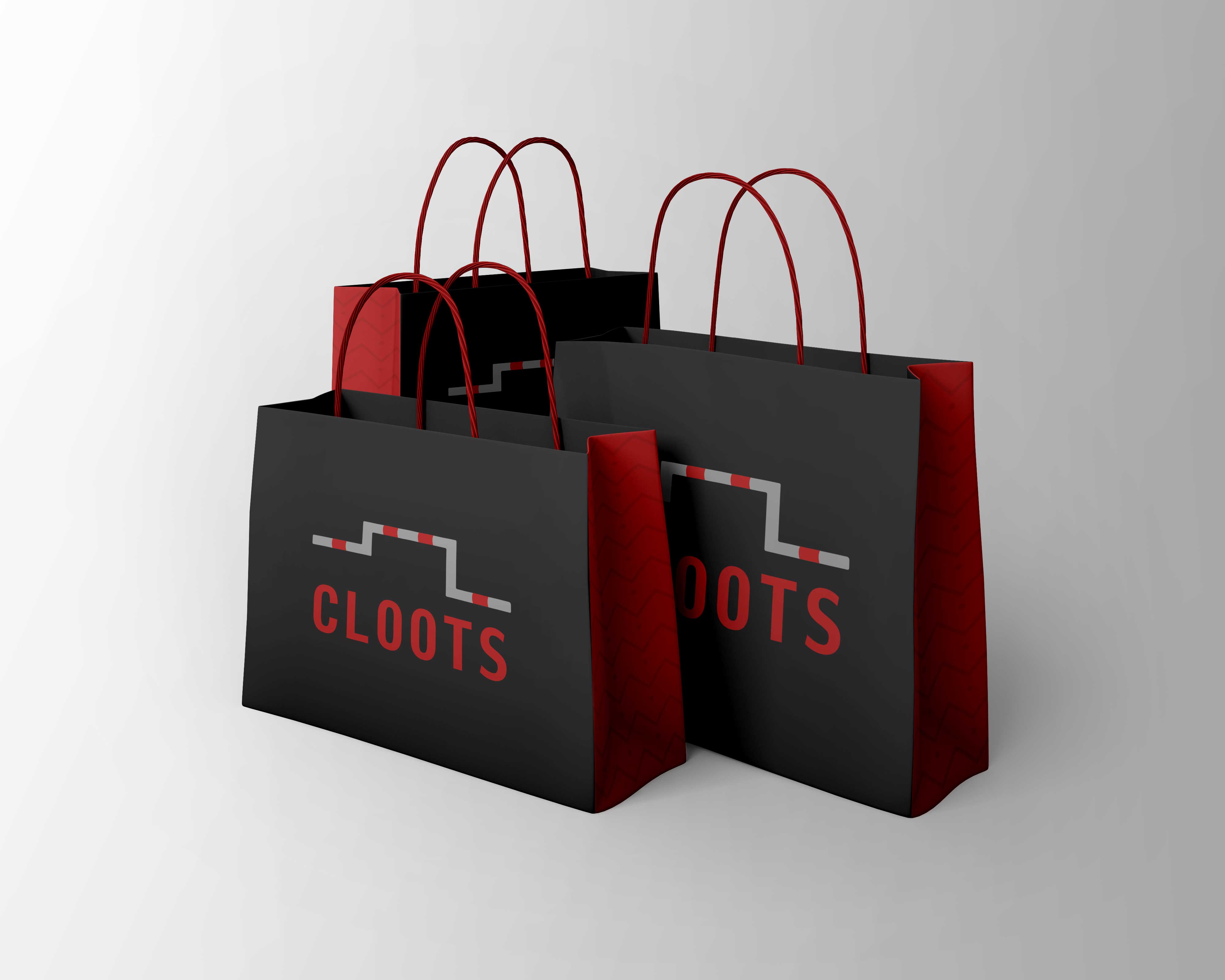
The logo consists of 2 parts, the element of the jumping bar and the typographical element of the name. In the jumping bar a stage is incorporated as a sign of victory and prestige.
This reflects the values of the company. The name Cloots has also been added to the logo to strengthen the image and recognizability.
Colours
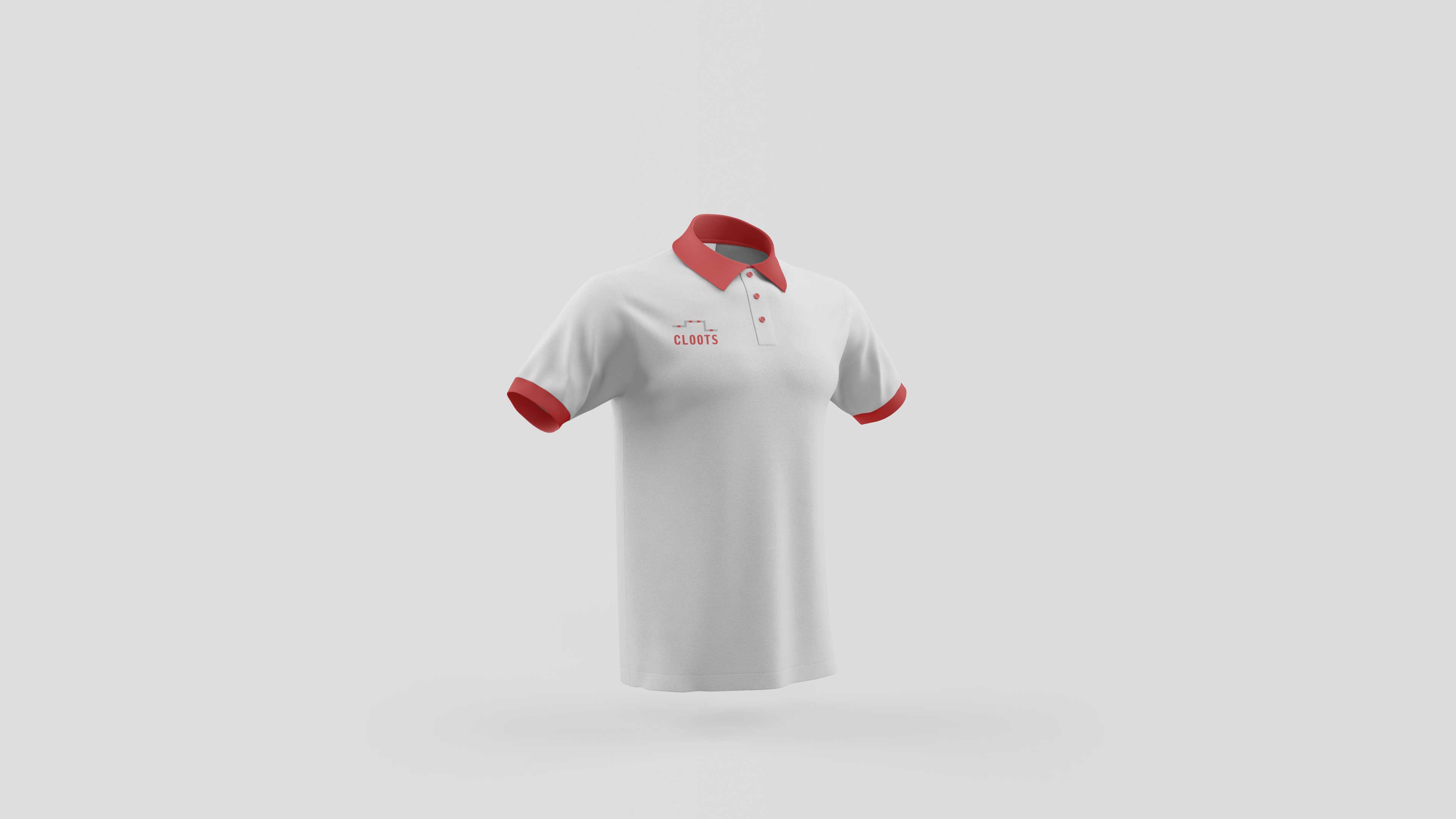
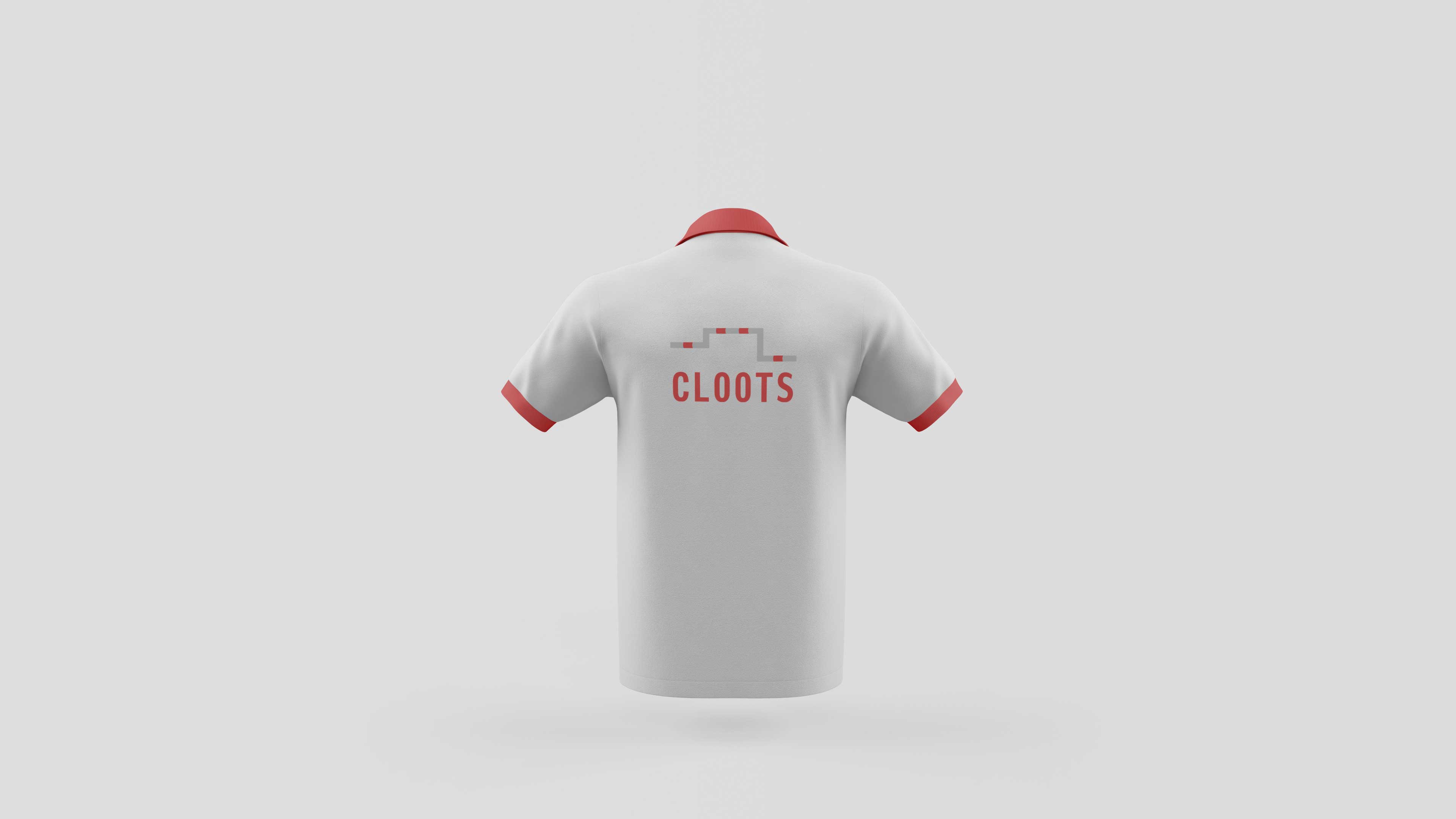
The main colour of the logo is red. This stands for the energy and passion that Cloots wants to share with its customers. The red is complemented by grey, which emphasizes the professionalism shown by Cloots in helping its customers to achieve their goals.

Design charter
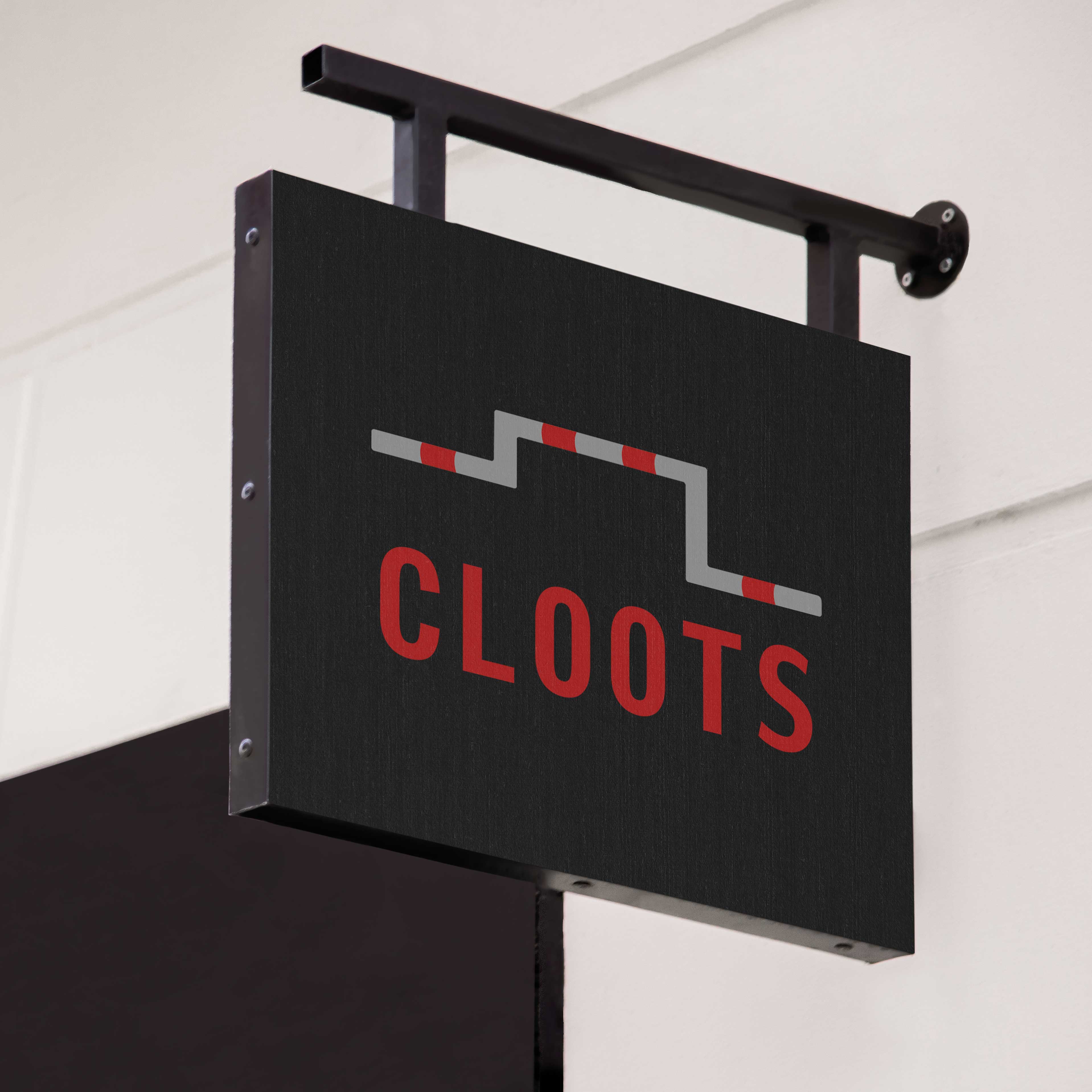
Brand manual
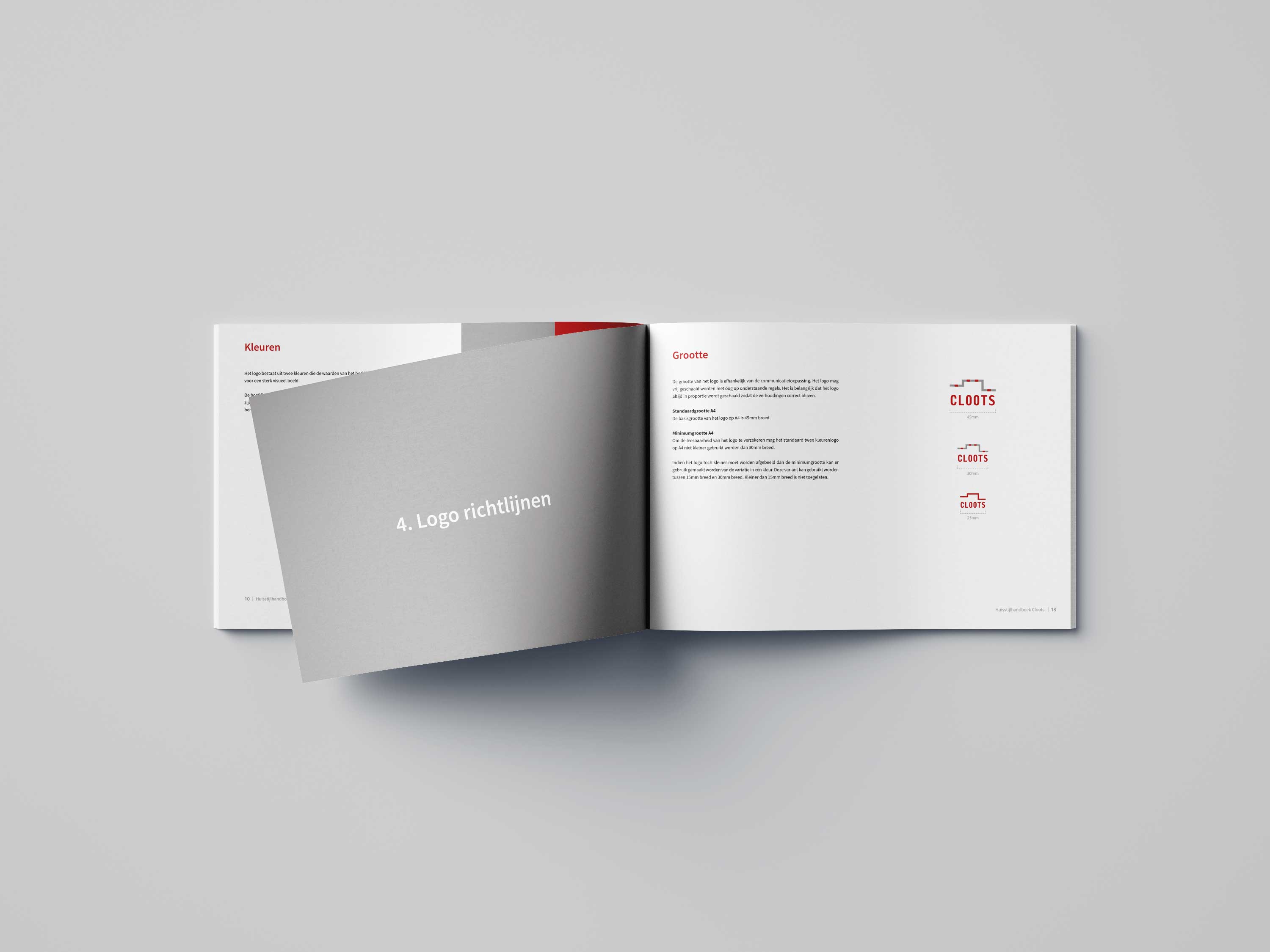
The brand manual contains information about the logo, colours and corporate identity guidelines. Would you like to take a look at it? View the digital version (NL).
